Your resume is usually the first impression a potential employer has of you. While your skills and experience are the most critical factors, the design and formatting of your resume can make a big difference. The right design choices can make your resume stand out, while poor formatting can make it look sloppy and unprofessional.
Follow these five resume design strategies to make yours look clean, modern, and eye-catching – just like a rockstar!
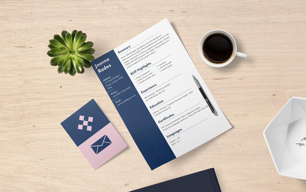
- Choose a Clean, Simple Layout
The days of overly designed resumes with images, graphics, and unusual fonts are over. Modern resumes have a clean, simple layout that is easy to scan.
Stick to a standard resume format like reverse chronological, which lists your most recent experience first. Use classic sections like Summary, Skills, Work Experience, and Education.
Avoid cluttered, dense blocks of text. Use white space between sections and bullet points for crucial information. This creates an aesthetically pleasing resume and makes your information easy to digest.
Pick a simple, professional font like Arial, Calibri, or Cambria. Font size should be 10-12 points for easy reading. Avoid using more than two complementary fonts.
The goal is a resume that looks organized, neat, and visually appealing at first glance. A clean design focuses the attention on your content.
- Use Strategic Color For Pop
While you want to avoid colorful, graphic resumes, a small splash of color can help certain elements stand out. Use color strategically to direct the viewer’s eye.
For example, if you want to highlight a certification or achievement, consider using a color for just that heading or bullet point. Avoid bright, jarring colors and use muted tones like a deep blue or gray.
Colors that complement the dominant black text include dark blues, greens, grays, and burgundies. Ensure the colored text has enough contrast from the background to remain legible.
A small pop of color can highlight important information and give a modern, visually interesting element. But be sure color is used sparingly and professionally.
- Showcase Your Personality
While creative resumes are out, you can add personality through typography and other subtle design choices. This helps you stand out while maintaining a polished appearance.
For example, you could use a font with personality, like “Rockwell” or “Baskerville Old Face” for section headers. Or add social media icons with links under your contact info.
Photos are only recommended if specifically relevant to the job. But you can include a simple graphic like a bar to visually separate sections.
The key is restraint. A slight personal touch gives the resume some character without looking unprofessional. Subtlety is key when adding personality.
- Use Strategic Design Elements
When used carefully, lines, text boxes, icons, and other visual elements can enhance your resume design. Avoid cluttering your resume with excessive boxes or lines.
Some strategic design choices include:
- Icons next to your contact information, like a phone icon before your phone number. This makes details easy to locate.
- Dividing lines or text boxes to contain the header and other sections. This visually separates information.
- Bullet points to break up dense sections into easy-to-read bits.
- A text box or lines to contain your header with your name and contact info. This distinguishes it from the body of your resume.
Like color, use design sparingly. The goal is an enhanced, balanced resume. A few visual elements guide the eye and promote scannability.
- Use Negative Space
Negative or white space refers to blank areas around text or graphics. It gives the eyes a break while reading.
Balancing negative space with your content is vital. Too much, and the resume may look oddly bare. Too little can make it look cramped.
Some tips for negative space:
- Use 0.5-1-inch margins on all sides.
- Include a gap between sections, like space between the header and summary.
- Add line breaks between bullet points instead of presenting them as one dense block.
- Be concise with descriptions. Avoid vast paragraphs of text.
The strategic use of white space prevents visual clutter. Follow the less is more principle, allowing breathing room around the text. This enhances readability and achieves a rockstar design.
Crafting a Rockstar Resume
Your experience, skills, and accomplishments should take center stage on your resume. However, design plays a supporting role in showcasing this information effectively.
Follow these strategies for a modern, polished, and visually appealing resume. A clean, strategic design prevents your resume from ending in the reject pile and helps you rock your job search.
The key is restraint. Avoid excessive colors, fonts, and other elements. Use design choices sparingly to enhance sections and information you want to highlight subtly.
With a professional, eye-catching resume design, you’ll show employers at a glance that you have both stellar skills and a rockstar aesthetic. So, embrace these design strategies to craft a resume that stands out for the right reasons.